1.22.2011

Because Studio

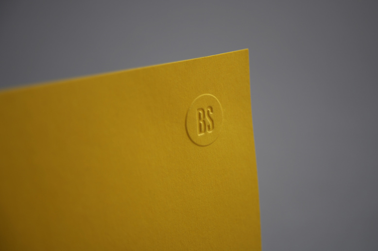
Interesting, considering they use a lot of foil and embossing on their other work. Irony? Pretty sure yes. These guys have obviously got a sense of humour.

A lot of what Because Studio do focuses on print processes and stocks to produce a quality effect. Their logo and ID work is simple but extremely effective.


1.19.2011

Tim Boelaars

Speaking of faff, sometimes it can work well. The below logos use a number of elements to build and sustain a memorable logo. Now thats not to say these won't work in black and white, but colour is a large part of building the brand identity. 

Another thing all the below identities have in common is a use of layered, textured backgrounds, both for the logo itself and behind the logo.

For example: what colour would you associate with Mars? Red. So for a brand named 'Gravity On Mars', what background colour would be most appropriate? A dirty red-brown? You got it.


Stefan Kanchev

The old Russian legend, Stefan Kanchev. Kanchev is the author of more than 1000 trade marks and symbols, 650 stamps, posters, post cards and envelopes, book covers, packaging and etc. 

So simply put... Legend.

What I think I take most out of Kanchev's work, apart from its real-life usability, is that each of his logos start off as simple black on white. I think in the end thats what makes a good logo stand out - its form is recognisable and "works" in black and white. It doesn't (necessarily) need any other faff.


Paul Tebbot

I love this very simple poster design from Paul Tebbot. Simple colours, simple shades, all based on the same sections of decreasing circles. It looks far more complicated than it is, and just goes to prove the more complicated design effects needn't actually be, ya know, complicated.

Mark Sloan 3


Mark Sloan 2

Another great example from Sloan Studios of how to effectively adapt a logo to other media and products. Fred is constantly berating us for simply plonking our logo on merchandise, and this is a great example of how to use not just the logo but its shapes and forms within other products.

I'm particularily a massive fan of the two posters below because they manage to use the form of the initial logo without it being to obvious or garish - its embedded into the design of the entire document. And then again there's the proposed physical application into a three dimensional object, again using the form of the logo and the identity as a whole to inform its design and meaning.

Mark Sloan

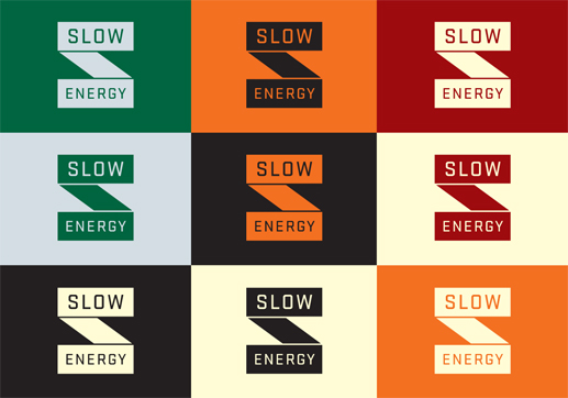
This identity by Sloan Studios for Slow Energy is interesting because of their display decisions of the logo itself. First it starts out pure black on white, then a number of potential colour ways, then a full on 3D wooden build of the logo. Sometimes logos are fine on a piece of paper or business card, but the physicality of an object can bring a new dimension (pardon the pun) to the identity itself, and add new possibilities of meaning to the brand itself.


I Love Dust

I Love Dust are fast becoming big heroes of mine, not just because they do a lot of work involving basketball players, but their icon work is superb. Their portfolio offers a wide range of various disciplines, and while it seems they mostly do illustration, as the stuff below shows they also do simple image work, and also clean and simple image editing. Plus they're not afraid to use a bit of the old gold foil/ink which is always a bonus!


Also with these book covers don't underestimate the effectivness of stock and specifically coloured stock. These are all black ink on colour, with the colours, in my view, reflecting the source material (for example the dark image of Deckard on purple stock for Blade Runner) and being used to ultimately minimise production cost and increase effect.


Ivana Martinovic