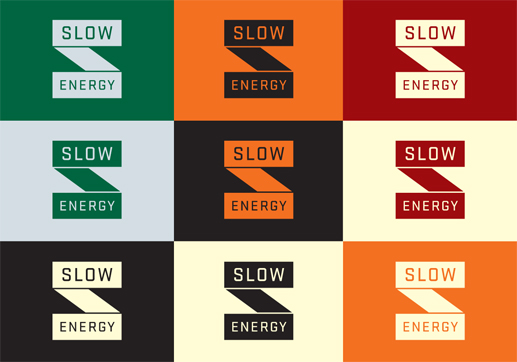
This identity by Sloan Studios for Slow Energy is interesting because of their display decisions of the logo itself. First it starts out pure black on white, then a number of potential colour ways, then a full on 3D wooden build of the logo. Sometimes logos are fine on a piece of paper or business card, but the physicality of an object can bring a new dimension (pardon the pun) to the identity itself, and add new possibilities of meaning to the brand itself.


No comments:
Post a Comment