
2.28.2011
YRbk 2nd meeting
So we had a second meeting today with INter Dis, it went really well, we got a lot sorted and i think as long as they keep to the deadlines they've set themselves it should all go rather smoothly. Here's a copy of our overview email to the course tutor:
"Hey guys,
Quick notes on yesterdays meeting (14:30, 28th Feb) –
Quick notes on yesterdays meeting (14:30, 28th Feb) –
- Next meeting arranged for Tuesday 8th March, time to be confirmed (approx. 14:30)
- Concept titled ‘Creative Imaginings Of Youth And Ignorance’
- Front cover installation to be made out of card, reducing costs.
- Approximate 60 pages in book.
- Each student to present 5-6 chosen images of work ranked in order in original raw files.
- Written content to be 50-70 words approx.
Quick note about the VAT that was mentioned, we’ve looked into it and have been told it’s not something we need to worry about at this stage as the college is VAT registered and it will all be taken care of after the final submission. So with all the quotes and budgeting we will be doing it’s not an issue.
For next meeting we will have –
- Stock samples
- Sample layouts for other pages
- Treatments for typeface and colours
For next meeting you will have –
- Test front cover maquette
- 2 students’ profile and work photos
- Concept profile photos
If you have any more questions or suggestions, please don't hesitate to
get in touch.
Kind regards"
2.26.2011
Sonic Pixel
My Sega brief was one of the ones i've found trickiest to get going with. I have an idea i think is pretty damn good, but its rather difficult to put either into words or onto paper, as in sketches and stuff. So i've put it off and put it off and not really done anything for it, but i just decided sack it, might as well crack on.
Basically to promote the anniversary of Sonic i want to take elements from the game - characters, objects etc - that are specific to and are representative of Sonic to all the fans out there, 16-bit pixelate them like in the original game, blow it up to large scale and paste it up around town, on walls, billboards etc, and base the rest of the promotion around it. So for example there will be 4ft high sonics (as below) pasted up.
Things to consider -
- Stock...waterproof stock is well expensive but im concerned print on standard stock will run when pasted of in the rain. Need to test.
- Audience...where it's put up affects who will see it
- Objects...it was pointed out to me that some of the things i wanted to do arent that recognisable so to make sure what i chose are recognisable.


2.24.2011
SP words+logo
Just trying to work with type on this SamplePhonics logo, I think the thicker, more in-your-face type is more appropriate when looking at similar logos and brands within the context this is going to appear in.
Also I'm trying to not just go straight with type, but work wth the type and manipulate it to fit the logo.


None of this is really working, and its kind of like pushing colours around that mix into brown - its a bit pointless. Going to try it simpler with less manipulation, just straight up, any changes to be small. Also with the actual logo itself. And the two words are different lengths, which on top of each other bugs me.

Think I've settled on this finish. The logo inbetween the two words equals out the discrepencies in the length of the two words next to each other. Simple.

2.23.2011


2.22.2011
YRbk Sample layouts
Okay, so theres quite a few layouts here, but its generally variations on 4 themes (we'll see what the course guys think next week!) Basically its all there to see, i dont think theres much explaination needed other than to say that they are developments and not finished spreads. When it comes to the end result it'll be a whittling down process with the client deciding on their favourite elements and then combining them.
We've discussed and decided as a group on a few things we want to keep universally across all our layouts, the main being display of images. Last year was details, name and 2 small images on one page, full bleed image on the next. Aaaaaaall the way through the book. We want to change it up. We want to have a certain structure to it but on in which we have elements that we can move around within, for example a standard set up name and details box and number of images. Then we can re-arrange depending on the students work (some work fits into a system better than others). Within this, because we want the focus to be on the work we want to make the main image BIG, as in full bleed and crossing the page, though not as rigid as that sounds. Basically we want it to feel like one page rather than 2, with work as the focus.
This first one i've quite blatently stolen elements from Empire magazine, of which i am a regular reader. The name and details in boxes are the main differentiator.
Using the structural idea i thought of fitting the name within a box, so increasing size and kerning to fit (If the surname is bigger, then its smaller, same for first names). I like it.
Adam;s convinced me to try and use Rockwell as the title font, which actually works really well. It's more formal than a sans-serif but less flashy or gaudy than a standard serif.
Went a bit craaaay-zee on this one, as we're always being told to go way-out with one idea and hey, they might like it. The font isn't appropriate but still awesome, and it works mainly because of the quality of the images, lots of white space giving the work itself room to breathe. This format wouldn't work on some of the images used in the first one.
Again with Rockwell and the title, keeping it simple. I like the sideways spreads too, makes the reader work for it.
We've discussed and decided as a group on a few things we want to keep universally across all our layouts, the main being display of images. Last year was details, name and 2 small images on one page, full bleed image on the next. Aaaaaaall the way through the book. We want to change it up. We want to have a certain structure to it but on in which we have elements that we can move around within, for example a standard set up name and details box and number of images. Then we can re-arrange depending on the students work (some work fits into a system better than others). Within this, because we want the focus to be on the work we want to make the main image BIG, as in full bleed and crossing the page, though not as rigid as that sounds. Basically we want it to feel like one page rather than 2, with work as the focus.
This first one i've quite blatently stolen elements from Empire magazine, of which i am a regular reader. The name and details in boxes are the main differentiator.
Open publication - Free publishing
Using the structural idea i thought of fitting the name within a box, so increasing size and kerning to fit (If the surname is bigger, then its smaller, same for first names). I like it.
Adam;s convinced me to try and use Rockwell as the title font, which actually works really well. It's more formal than a sans-serif but less flashy or gaudy than a standard serif.
Open publication - Free publishing
Went a bit craaaay-zee on this one, as we're always being told to go way-out with one idea and hey, they might like it. The font isn't appropriate but still awesome, and it works mainly because of the quality of the images, lots of white space giving the work itself room to breathe. This format wouldn't work on some of the images used in the first one.
Open publication - Free publishing
Again with Rockwell and the title, keeping it simple. I like the sideways spreads too, makes the reader work for it.
Open publication - Free publishing

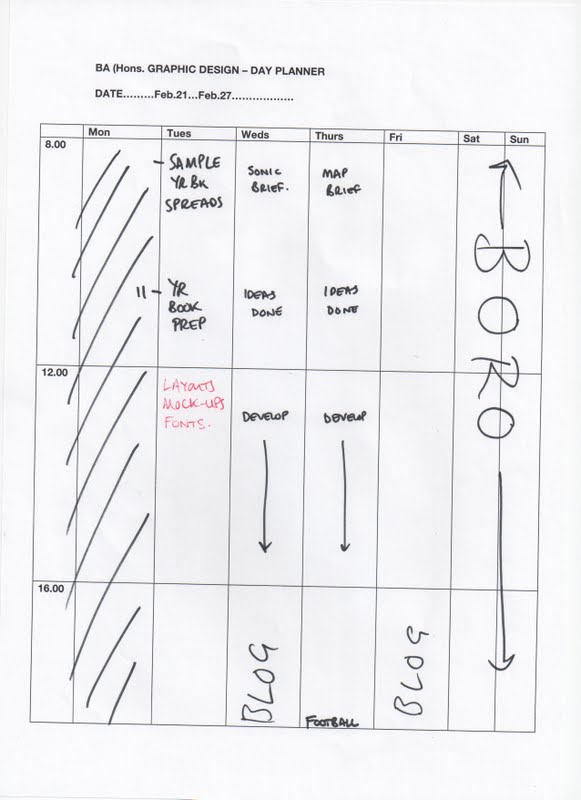
2.21.2011
2.20.2011
SP logos+black
Using the logo I've chosen I thought maybe I'd go down the whole 'music' route and put a bit of a retro feel to it with an old school vinyl needle as part of the online logo.

2.17.2011
YRbk quote - Duffields
We just got a quote back for printing from Duffields - this is not including the mass discount we might get from having numerous course year books and is inclusive of our own first choice stock we found from out sample enquiries.
Size 210X210
Cover: 4 Pages, Text: 40 Pages.
Origination Output from print ready PDF files supplied.
Proofs Pdf proofs.
Print 4 colour process + 1 Sealer both sides.
Paper Cover: 250gsm Regency Satin. Text: 115gsm Regency Satin.
Finishing Fold; perfect bind and trim to size.
Delivery
Quantities & Pricing 400 £1,670.00

SP - +words
Couple of type treatments. I had the idea of the circular SP inside a gramophone needle, which i actually dont think works. With the arm coming off its too much, and without it its hard to distinguish what it actually is, so it'll probably be a no-no for that one. Its like Craig Oldham form Music said, sho it or say it, but dont do both.


2.16.2011
SP - First Logos
Expanding the 4 main logos i developed. Again more of a focus on the letters and specifically trying to link the two.
Quite happy with this one, especially as Adam said it "looks like on of those dj disc things". So i guess i'm in the right area. Of the four final black ones, the first one seems the strongest, probably because of such a large black area. Losing the detail on the others might help them in that way.
Well i've had Superman and Warner Bros. for this one so far, so probably not this one. Just trying to play with the symmetry of the curves on the top half of the characters.

Again with the discs, keeping this to just the three circles, utilising the curves of the letters.
Keeping the S and P wrapped around each other, again with the circular discs. The central P provides the detail. It's meant to be a little uneasy to figure at first, you kind of see the whole and the representation of a record before the detail.

Quite happy with this one, especially as Adam said it "looks like on of those dj disc things". So i guess i'm in the right area. Of the four final black ones, the first one seems the strongest, probably because of such a large black area. Losing the detail on the others might help them in that way.


Well i've had Superman and Warner Bros. for this one so far, so probably not this one. Just trying to play with the symmetry of the curves on the top half of the characters.


Again with the discs, keeping this to just the three circles, utilising the curves of the letters.


Keeping the S and P wrapped around each other, again with the circular discs. The central P provides the detail. It's meant to be a little uneasy to figure at first, you kind of see the whole and the representation of a record before the detail.


Woodwork
There's two ways of making the installation out of wood, first being to cut out the front and back forms, adding the side sections after, the second is to cut out multiple copies of the letterforms to glue back to back creating depth. The second would be easiest, though not necessarily cheapest, so Adam went down to wwodwork today to ask prices and materials.
 It seems MDF would be our cheapest option, best for cutting and best for painting onto. It costs £16 per 6"x4" (2440mm x 1220mm) sheet at 18mm thick. Our estimates for letter sizes would be approx 600mm x 560mm If we were to do the word "inter disciplinery" thats 17 letters, requiring 2 sheets. 2 sheets is £32 and we would require between 4 to 5 for each board to achieve the required depth. So we would need either 8 or 10 boards priced at £128 (8) or £160 (10)
 We've worked out that with glue, brushes, paint etc this would all cost around £200, which we found out wouldn't come out of our print budget. Fortunately the Inter Dis. team are already doing fundrasiers for it so that shouldn't be too much of a problem.


Subscribe to:
Posts (Atom)