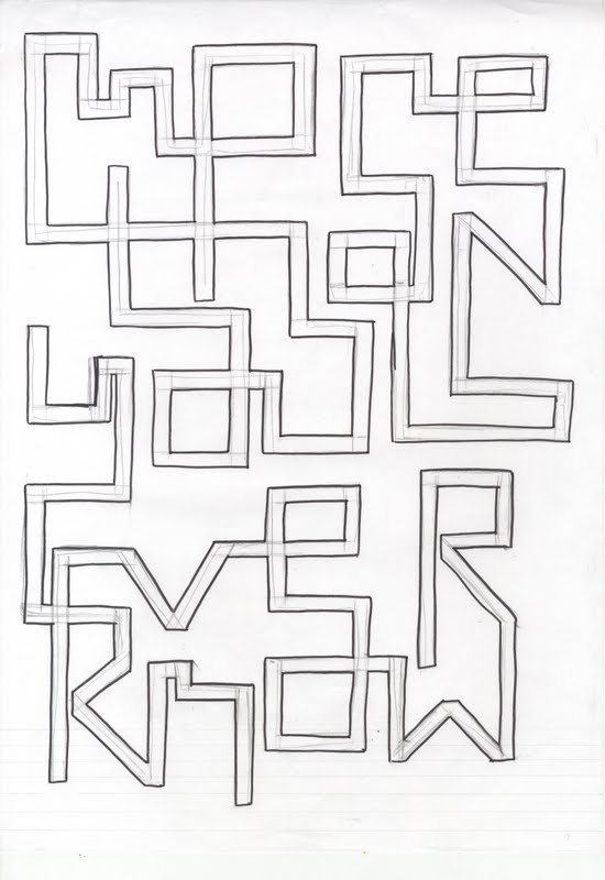
Ok, things are getting a little messy. And we are not paricularily happy about it.
Todays meeting has been, well, not good. Basically we had agreed a number of deadlines for copy and for images, from students and tutors alike. Jaclyne has busted a hump getting us the majority of student work, but the work from tutors has been slow in coming. Now we've returned after the Easter break and turned up to a meeting where when we've sat down, a new tutor has entered the meeting (having only been to one before) asking us to explain 2 months of design directions and then asking us to change half of it. We spent the best part of 2 and a half hours trying to go through stuff that we'd already decided on when the meeting could've lasted less than half an hour.
The changes we've been asked to make is to remove the work in public section (which was requested by them at the start), move it to the back, take out a number of quotes pages which act as buffers between student spreads, and basically fill 5-6 double page spreads with alumni work; in effect profile pages for ex-students. It's not something the students want (in fact they are adamantly against it) and this was the first time anyone outside the course tutors had heard of it.
Now we understand that dealing with clients is a precarious process, trying to work towards an end product that in the end belongs to them, but we don't think we're just spitting our dummies out at this situation. 4 weeks ago (and further) it was agreed the number of pages of the document and the layout of these spreads. Now that may be subject to changes, but not wholesale changes as we've been asked to, with content that we, and the students, think is counter to what this yearbook is, being a showcase for their work. The plans for alumni profiles spread from 2-3 pages each, involve poor quality images taken from websites and involve body text of night on 300 words, when current students only have 50-70.
Having said all that (and we tried to very politely let them know that we were pretty sure this was a bad idea, to no avail) we worked with them in todays meeting for over an hour to sort out how exactly we can work this in. Its a hard line to draw because we need to be firm but not offensive, so we've taken the images (where there were other issues) and told them we'll go away and do what we can, and basically do a version like they want, and a version like we've agreed for all this time.
Adam sent a very precise email to cheryl about it afterwards. He wasn't a happy bunny:
(and very kindly put my name first. Cheers adam.)
We have left the meeting pretty confused about what is happening, due to students and tutors having conflicting ideas. The newly proposed section devoted to ex-students seems unnecessary and confusing for the user. These images would work as a backdrop to quotes pages, but this inclusion should have been mentioned weeks ago. We are trying to deliver the appropriate outcome that we would all be happy with but with such tight deadlines and other factors, we cannot afford to change the structure so significantly that it puts the whole project in jeopardy.
The profile and introductory spreads are now in progress, and will be delivered on time. However, the delays and confusions surrounding sections and structures ultimately means that we will be left without direction, which means these sections would have little or no context. At this point in the project it is imperative we are all on the same page.
Our deadline to have the whole book designed is the 9th May. That means we have potentially two more weeks of development before we hand it over to the printer.
We still need a significant amount of copy and images from you to complete the book.
- Acknowledgement page copy
- Quotes for 5x spreads
- Student images (To be shot on Thursday)
- Cover photography (To be shot next Tuesday)
- Outstanding copy for students profiles
- Events/ Work in public copy/images (we still need clarification on what this is going to be) (we suggest doing some sort of introduction to this section)
- All contact details for students
This is a massive list, and we are certainly worried. We cannot afford to waste any more time discussing options and page layouts this close to final hand ins, not just for this brief but for our personal work.
We will put together the final spreads for the introduction, contents and profile pages ready next week and we will send Jaclyne a PDF of what we have next Tuesday. We will continue to liaise with Jaclyne on behalf of the students to rectify the issues raised today.
Dan, Luke and Adam